
10 Things I Wish Every Client Knew Before Choosing Paint Colours
Paint can feel like the easy part of a renovation. It’s one of the least expensive material decisions you’ll make, it’s not permanent the way tile or cabinetry is, and there’s thousands of colours to choose from. So why does it trip up almost every client we work with? Today we’re sharing how to choose paint colours for your home.
After years of helping homeowners across Parkland County and the greater Edmonton area choose finishes for their homes, I can tell you: paint colour is one of the decisions people regret most. It’s not usually because they picked a “bad” color, but because of a handful of small, avoidable mistakes. Here’s what I wish every client knew before they painted their interiors:
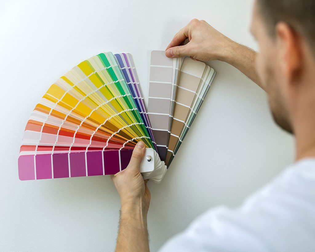
1. The colour on the swatch is not the color on your wall
That little paint chip in the store is lit by fluorescent lighting and surrounded by white space, neither of which (usually) exists in your home. Here’s my top tip on how to choose paint colours for your home: always test paint on your actual wall, in your actual room, before committing. I always recommend painting a swatch that’s at least 2 x 2 feet on your wall and looking at it throughout the day as the light changes in your home. You can buy sample pots of paint for only a few dollars, and they’re worth every penny!
2. Undertones matter more than the colour itself
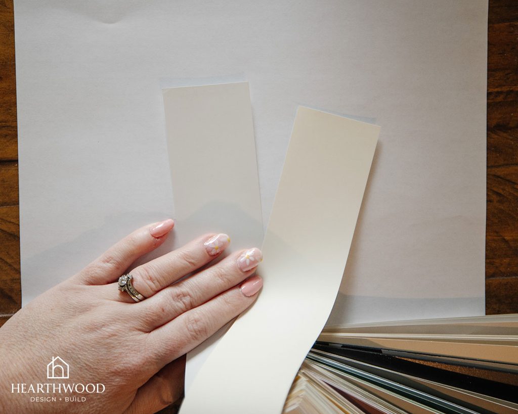
Two white paint colours can look completely different once they’re on the wall. One might lean warm and cozy, another cool and a little flat. Before you fall in love with a colour, ask what undertone is hiding underneath it (pink, green, blue, yellow are the most common culprits). This is where a lot of paint regret actually comes from (we’ve definitely seen a beige paint look pink once it’s up on the wall)!
One easy way I like to see the undertones in paint colours is to lay my paint chips over a piece of bright white printer paper. The undertones should pop, like in the above photo where you can see one white paint chip with a grey undertone, and one with a yellow undertone.
3. Alberta light changes everything, literally
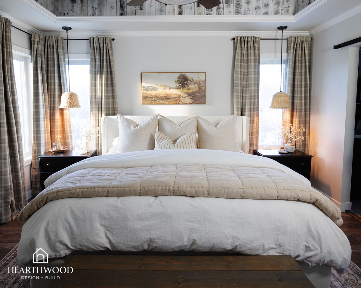
Our light here is different depending on the season, and it’s worth planning around. A north-facing room gets cool, flat light most of the year, especially through our long winters, while a south-facing room gets warm, golden light. The same paint colour can look completely different in each. If you’re testing paint in July, remember to picture that wall in January too.
We typically recommend choosing a warmer paint colour (something with brown or yellow undertones) in a north-facing room, and a colour with cooler undertones (blue or grey) in a south-facing room to offset the natural light tones.
4. Test in more than one spot, and at more than one time of day
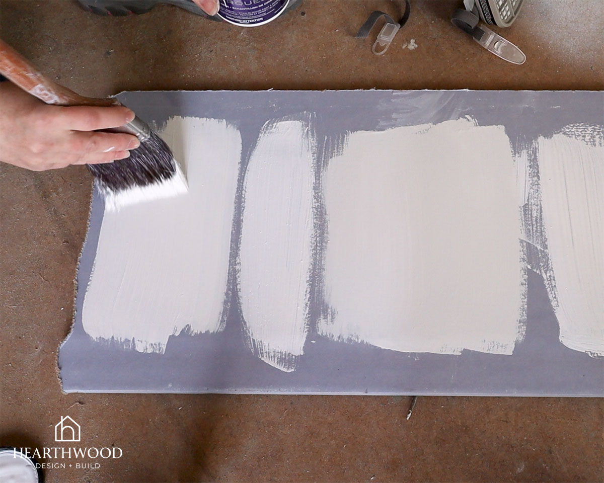
One swatch on one wall isn’t enough. Paint a sample on at least two different walls, and check it in the morning, afternoon, and evening. Colours shift dramatically depending on the light hitting them.
If you don’t want to put paint on your walls, you can also paint a scrap piece of drywall or poster board with multiple swatches and move it around your space.
5. Start with what’s already fixed in the room
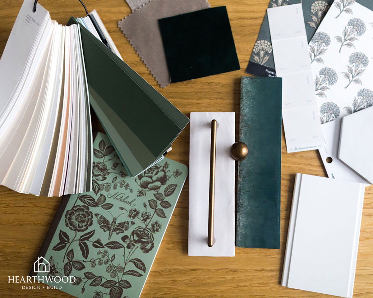
Before you choose a wall colour, look at what you’re not changing: flooring, countertops, cabinetry, big furniture pieces. Those fixed elements should drive your paint choice, not the other way around. A cool-toned grey tile can clash with a warm-toned beige paint colour. We always tell clients to choose paint last, not first.
6. LRV (light reflectance value) is worth understanding
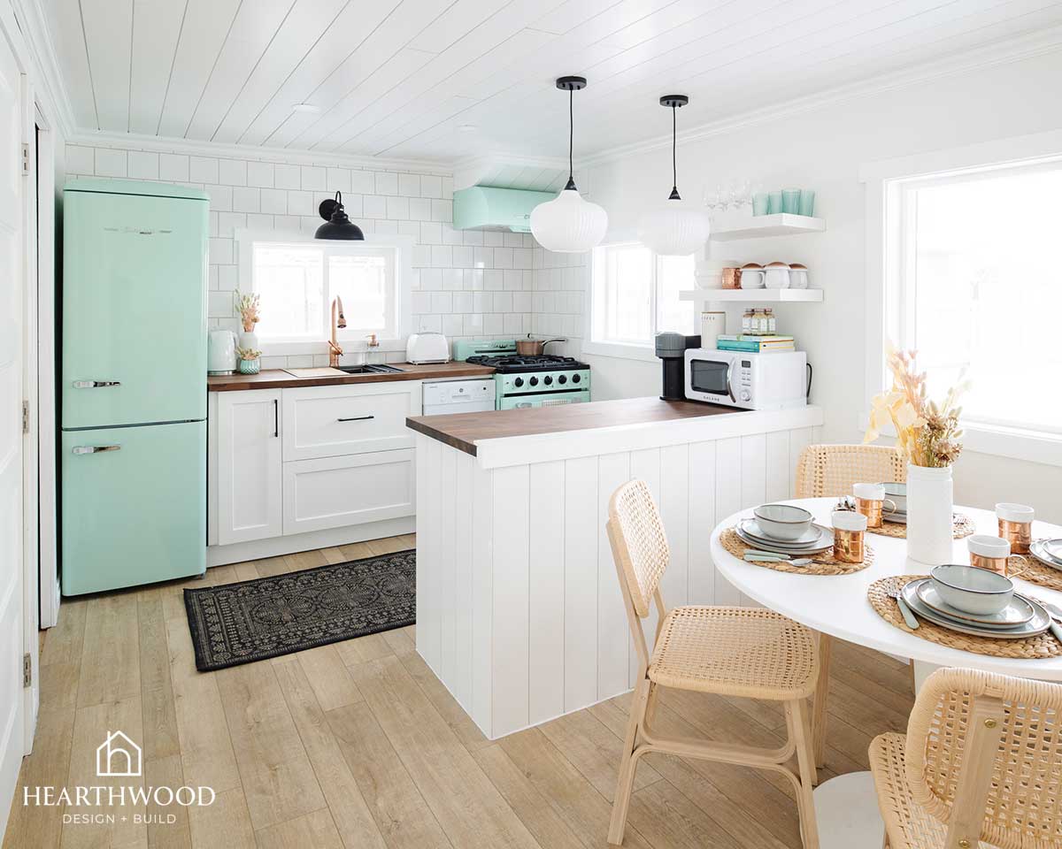
Every paint colour has an LRV, a number that tells you how much light it reflects versus absorbs. Higher LRV colors make a room feel bigger and brighter; lower LRV colours feel cozier and more dramatic, but can make a small room feel smaller. If a room already feels cramped or dark, this number matters more than the colour name.
7. Sheen is an important decision
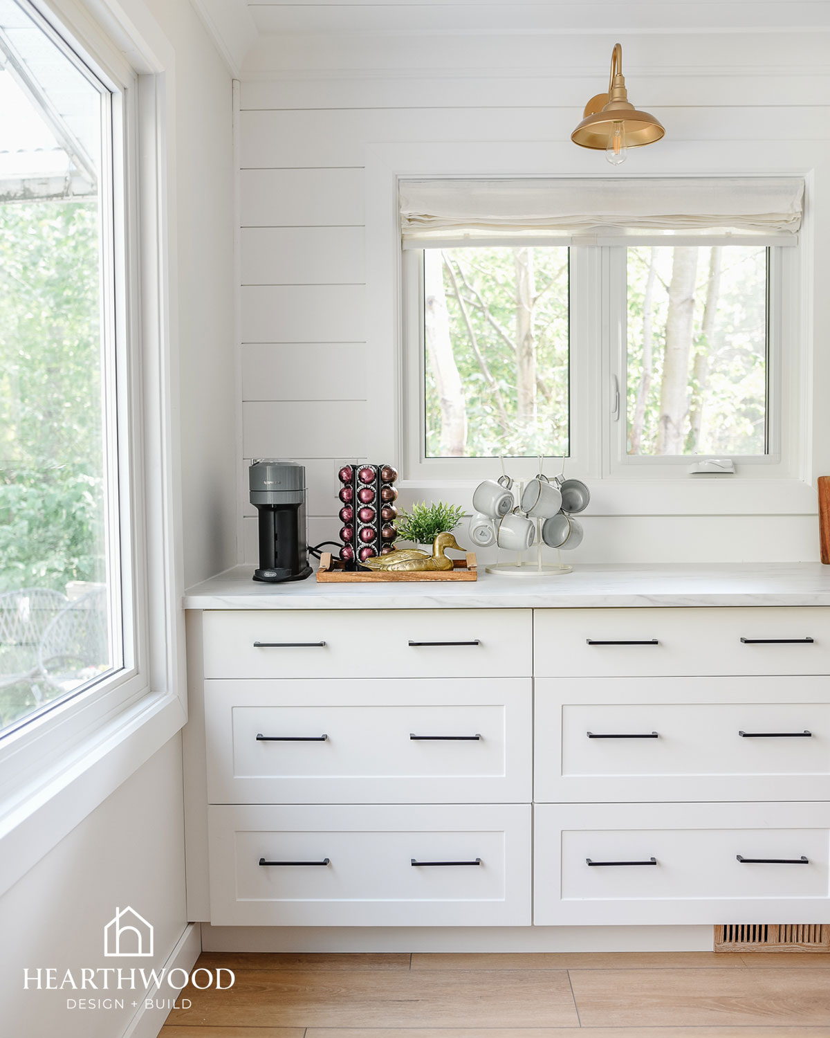
Flat, eggshell, satin, semi-gloss: the finish you choose affects durability and how forgiving the paint is of imperfections, not just how it looks. High-traffic areas, kids’ rooms, kitchens, and bathrooms need a different sheen than a formal living room. We usually recommend a satin or semi-gloss for doors and trim because it’s easy to clean, and an eggshell for walls. Don’t let sheen be the last five-second decision at the paint counter.
8. Trim colour deserves as much thought as wall colour
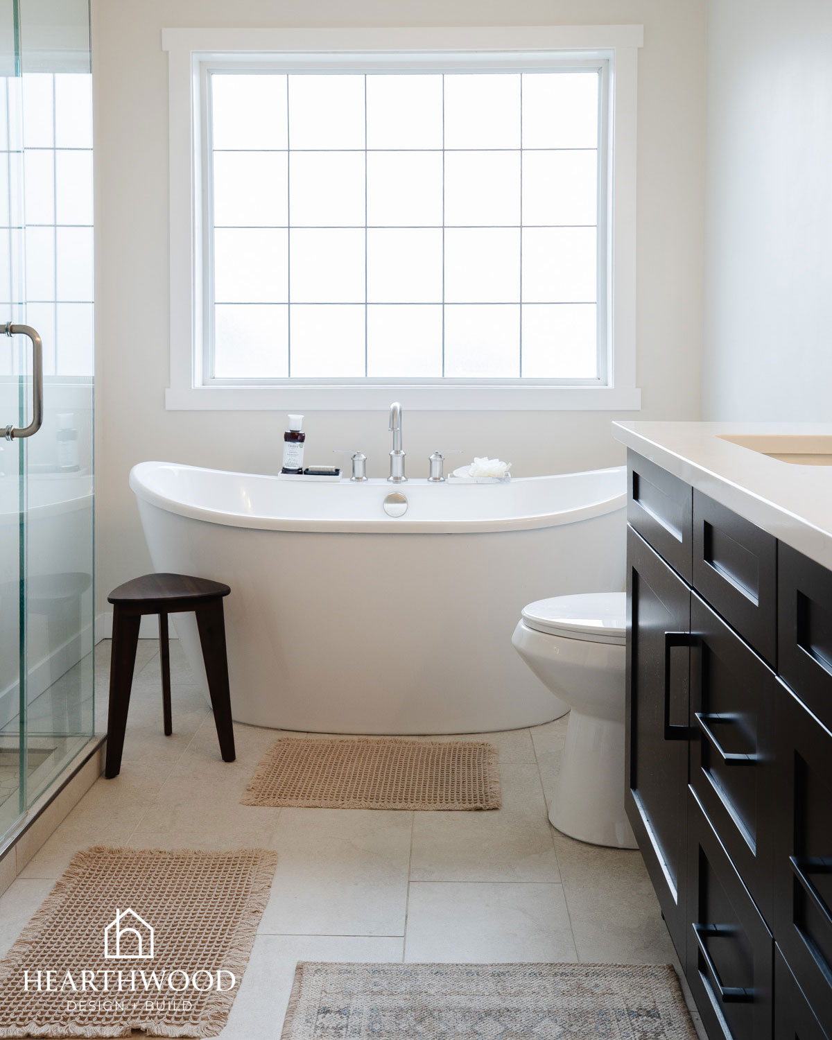
We see so many beautiful wall colours undone by trim that was an afterthought. Trim frames every room, and the relationship between your wall colour and trim colour (matching, contrasting, or somewhere in between) has a huge effect on how finished a space feels. In general, we love a true-white trim colour like Benjamin Moore Chanilly Lace for most rooms, but we’ve designed some spaces where the trim is the same colour as the walls with a different sheen. That can look stunning, too!
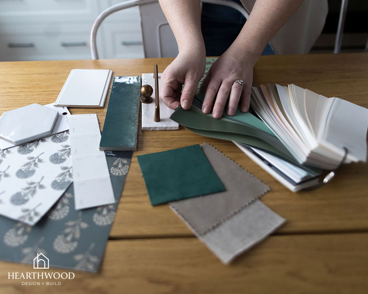
9. Live with a sample for a few days before committing
It’s tempting to paint a little sample and make a decision on the spot. Give it a few days. Walk past it in the morning with your coffee, and in the evening with the lamps on. Colours that feel right in the first five minutes don’t always feel right a week later, and colors that feel “off” at first sometimes grow on you. How to choose paint colours for your home? It requires a big dose of patience!
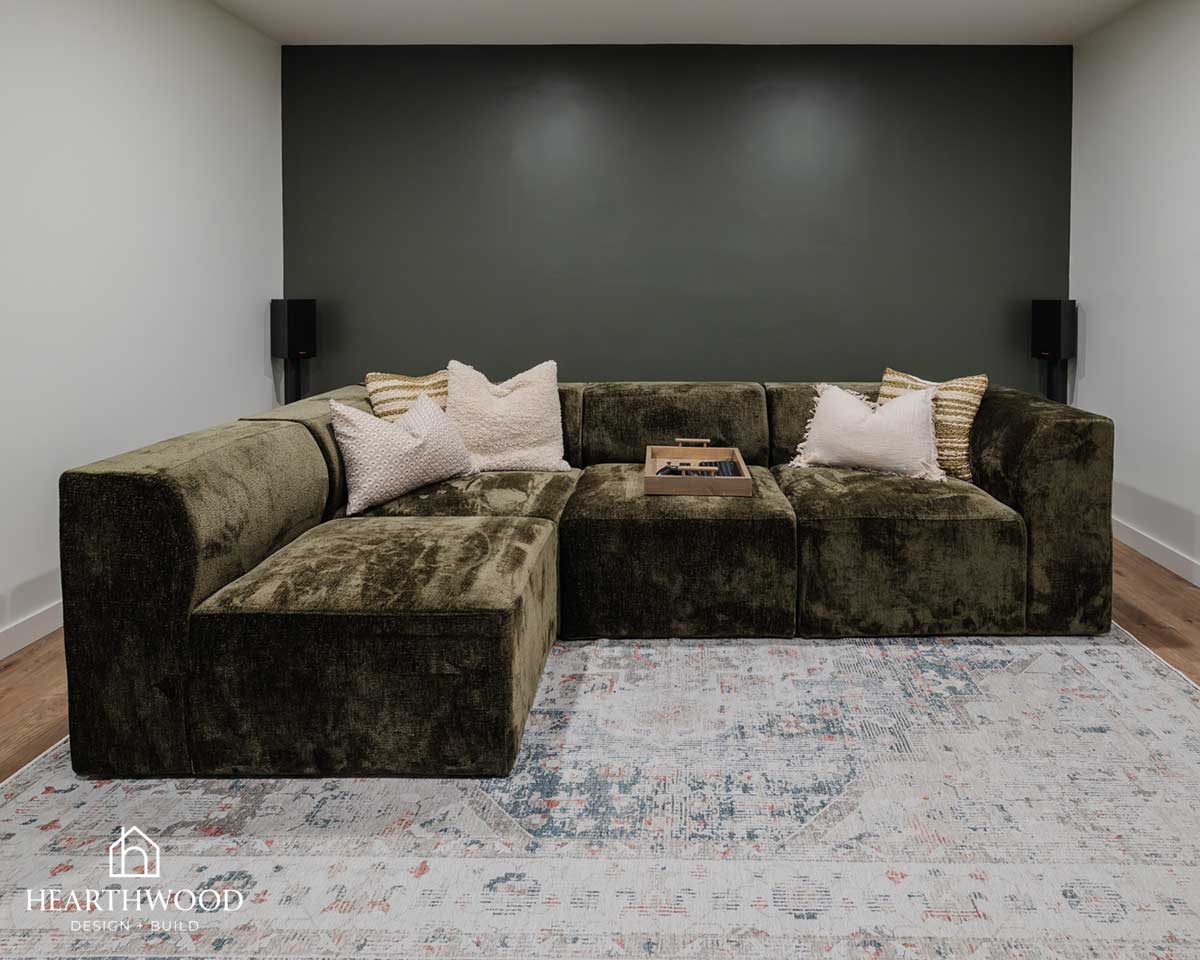
10. Timeless beats trendy, especially if you’re not repainting soon
Trend colors come and go fast, and a full repaint is one of the more disruptive, and time-consuming things to redo. If you love a trendy colour, use it somewhere lower-commitment: an accent wall, a powder room, cabinetry, rather than your main living spaces. Save the big, hard-to-change surfaces for colors you’ll still love in ten years.
Paint feels small, but it’s one of the decisions that shapes how a whole room feels every single day. If you’re planning a renovation and want help choosing finishes that will actually work for your space (and your light), that’s exactly what our Design + Planning Package is for!